

Speedo India
Shop by why you swim.
A purpose-led redesign of Speedo India's online store, helping every kind of swimmer find the right gear and the right fit.
- Client
- Speedo India
- Project
- Digital shopping experience redesign
- Our role
- UX research, UI/UX, visual design and A+ content
- Where
- India
- Dimensions
Disciplines: Brand · Digital
Speedo makes gear for every kind of swimmer, from a child’s first lesson to an Olympic final. Online, that range was also the problem: technical detail, fits and sizing made it hard to know where to start.
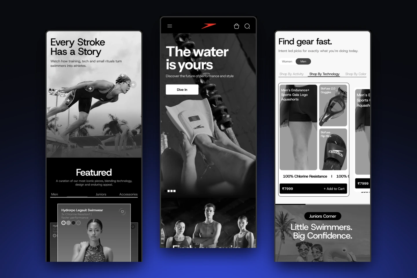
The Evo Collective redesigned Speedo India’s digital shopping experience around a simple question: why do you swim? The answer shapes what shoppers see, which products they’re shown and how they choose a size.
The challenge
Too many technical choices.
Speedo serves first-time swimmers, fitness swimmers and competitive athletes. Between technical features, fits and sizing, shoppers found it hard to tell which product was right for them.
The idea
Start with why people swim.
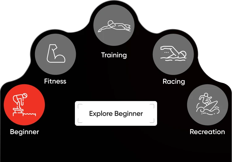
Organise the store around purpose, not product type. Shoppers pick their kind of swimming (beginner, fitness, training, racing or recreation) and are guided from purpose to product to fit.
One idea, 2 dimensions
How the disciplines connected
Digital
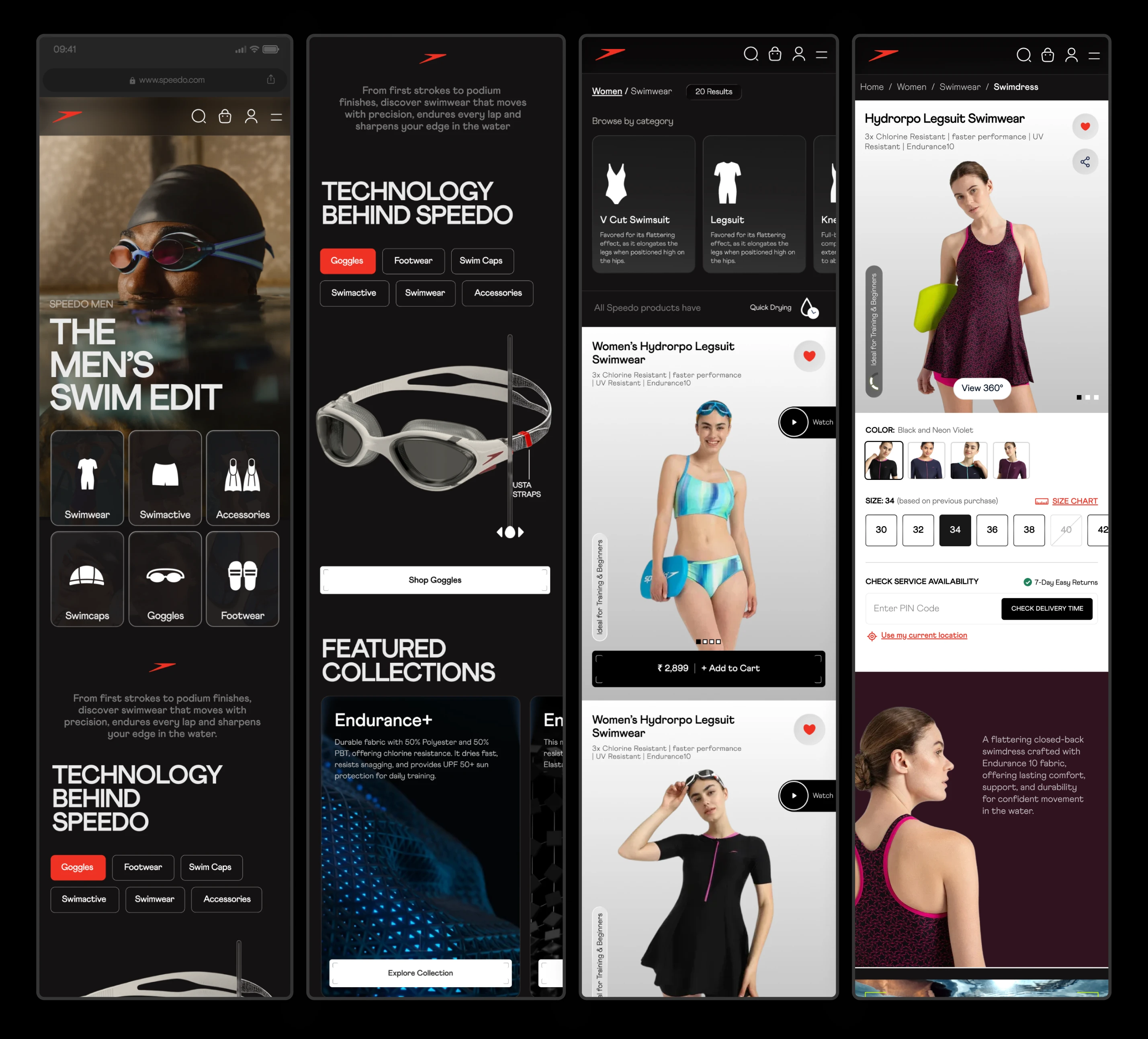
Intent-led discovery, an interactive fit profile in place of static size charts, and gear pairing on the product page turned the catalogue into a guided path.
Brand
A dark, editorial visual system with water-inspired motion carried Speedo's performance character across desktop, tablet and mobile, and into A+ content and infographics.
Visual sequence
The research
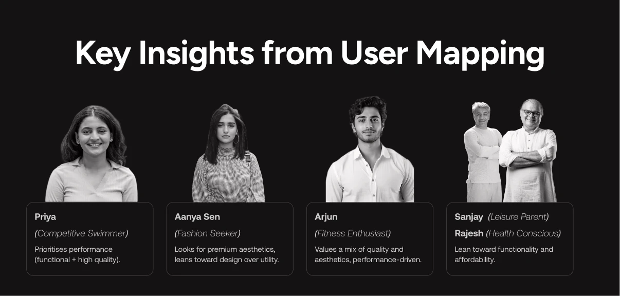
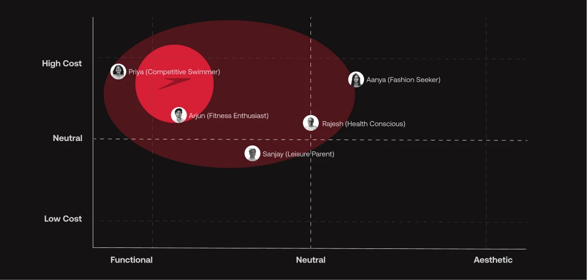
Browsing and audience data, plus personas ranging from a 28-year-old triathlete in Bangalore to a 55-year-old in Ahmedabad who had just started swimming on his doctor's advice, shaped who the store had to serve.
Find Your Swim
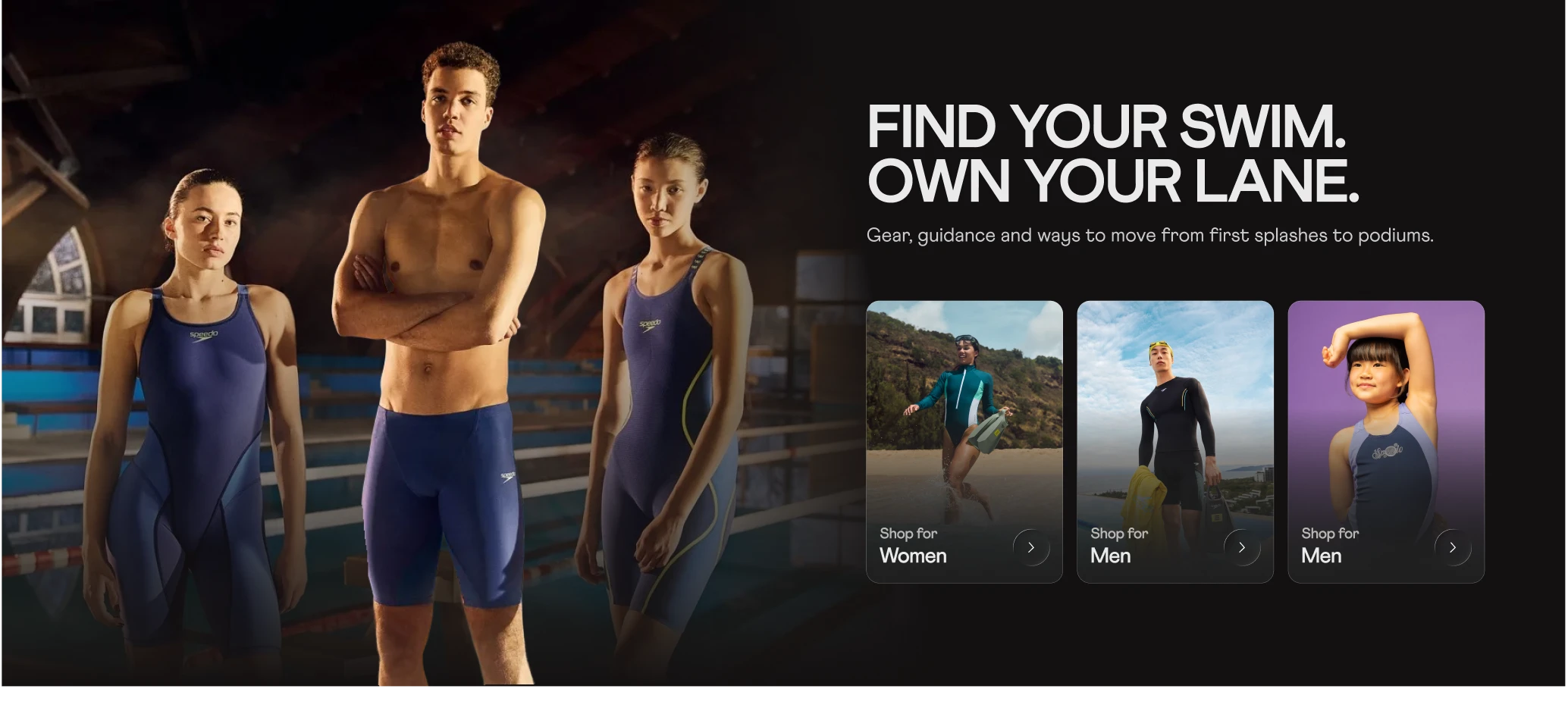
Discovery starts from the swimmer's goal rather than a static catalogue, with a separate path for each kind of swimming.
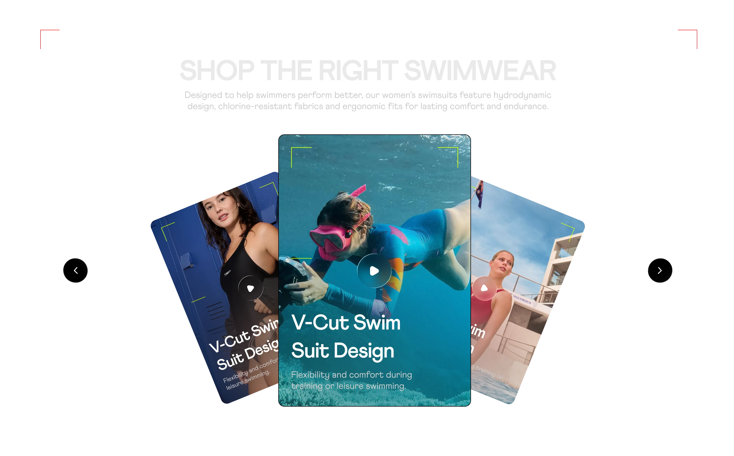
Immersive discovery
An editorial, full-bleed layout with dark-mode performance styling, so browsing feels closer to the sport than to a spreadsheet.
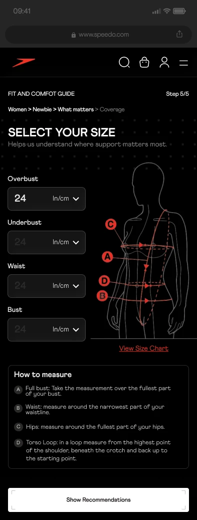
Smart fit and size engine
Interactive fit profiles replace static size charts. Shoppers enter a few measurements and get a size recommendation before they buy, which tackles the uncertainty behind size-related returns.
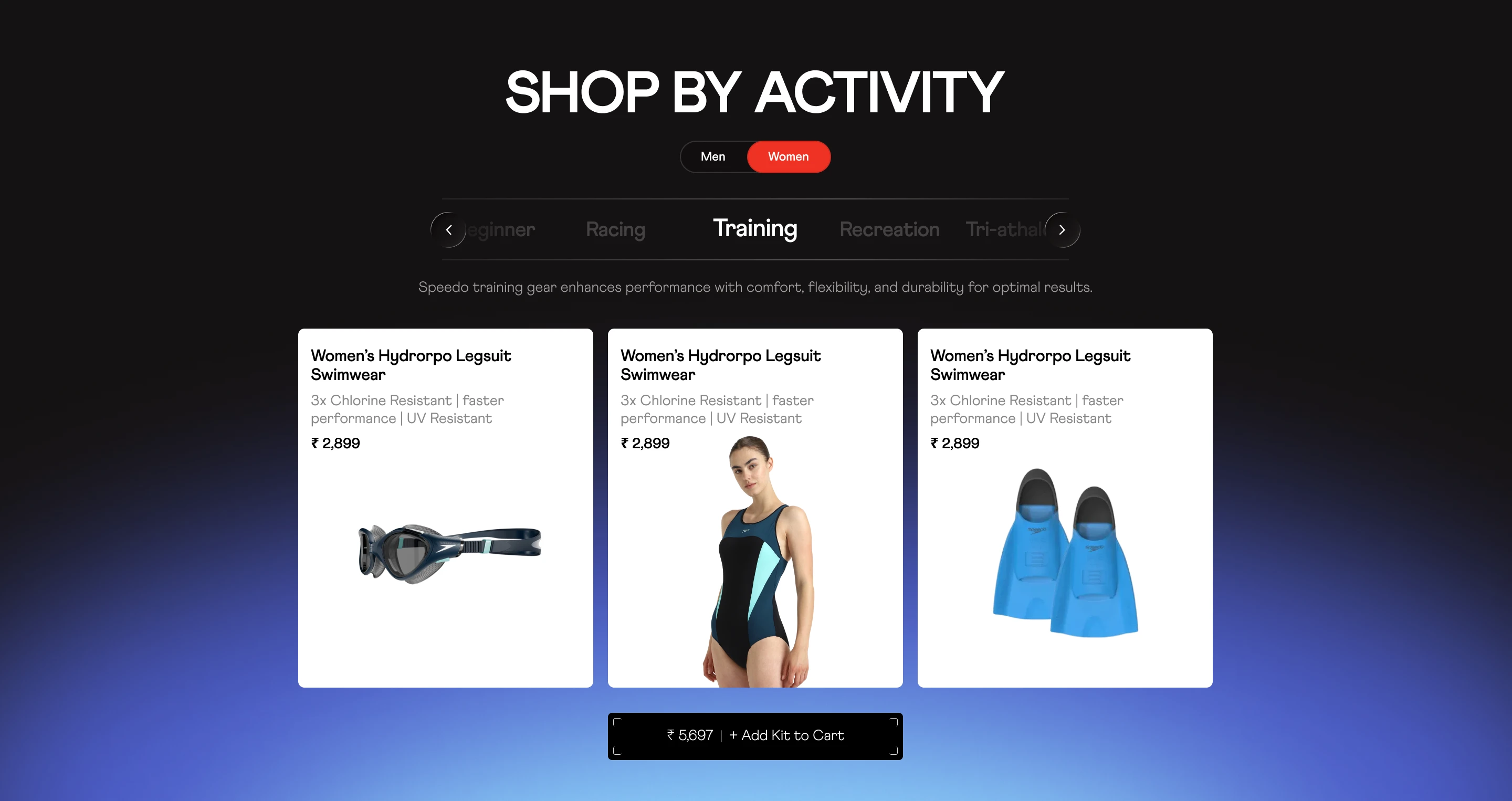
Contextual pairing
Caps, goggles and fins appear as a kit beside the swimsuit, matched to the activity, so the right accessories are one tap away.
The visual system
High contrast and dark mode throughout, with fluid, water-inspired micro-animations and the same system carried across desktop, tablet and mobile.
What changed
- faster time to cart
- +34%
- Reported improvement in how quickly shoppers reach the cart.
- size-related return enquiries
- −28%
- Reported drop in enquiries about returns for sizing reasons.
- cross-category accessory attach rate
- +42%
- Reported rise in shoppers adding accessories from another category.
- Guiding people from purpose to product to fit made the store easier to shop and the right size easier to choose.
About these results. Figures as reported for the redesigned experience. No measurement period or method was published with them, so read them as indicative.
Credits
- Client
- Speedo India
- Agency
- The Evo Collective
- Role
- UX research, UI/UX, visual design and A+ content
- Platforms
- Desktop, tablet and mobile
Sources
- Project design files and case-study notes for the Speedo India digital shopping experience.